

The Guide to Doomsday
Organizing 18 years of chaos into a single infographic for the road to Avengers: Doomsday

Starring: Lizzy the Ronin
Guest Starring: The Multiverse
Sometimes, a Ronin has to go back to school. That’s me…
I recently finished a project that was fun; but also a headache! The mission? Create a functional infographic for something…anything. Naturally, I chose Marvel Studios.

Last semester, I wrote a marketing plan for Avengers: Doomsday, so I decided to dig deeper. With the 2026 landscape shifting toward “quality over quantity,” fans are feeling the “superhero fatigue.” They don’t need more content, but rather a Utility Map to tell them what actually matters. Now, what made the research fun and easy, was that I was able to go back to my Doomsday marketing plan and double check certain things.
The Assignment: From Brainstorm Infographic
The goal was simple but the execution was a challenge. I had to:
Learn from the audience: I spent time online to track what fans were asking: “What do I actually need to watch to understand the next Avengers?” This was the main question.
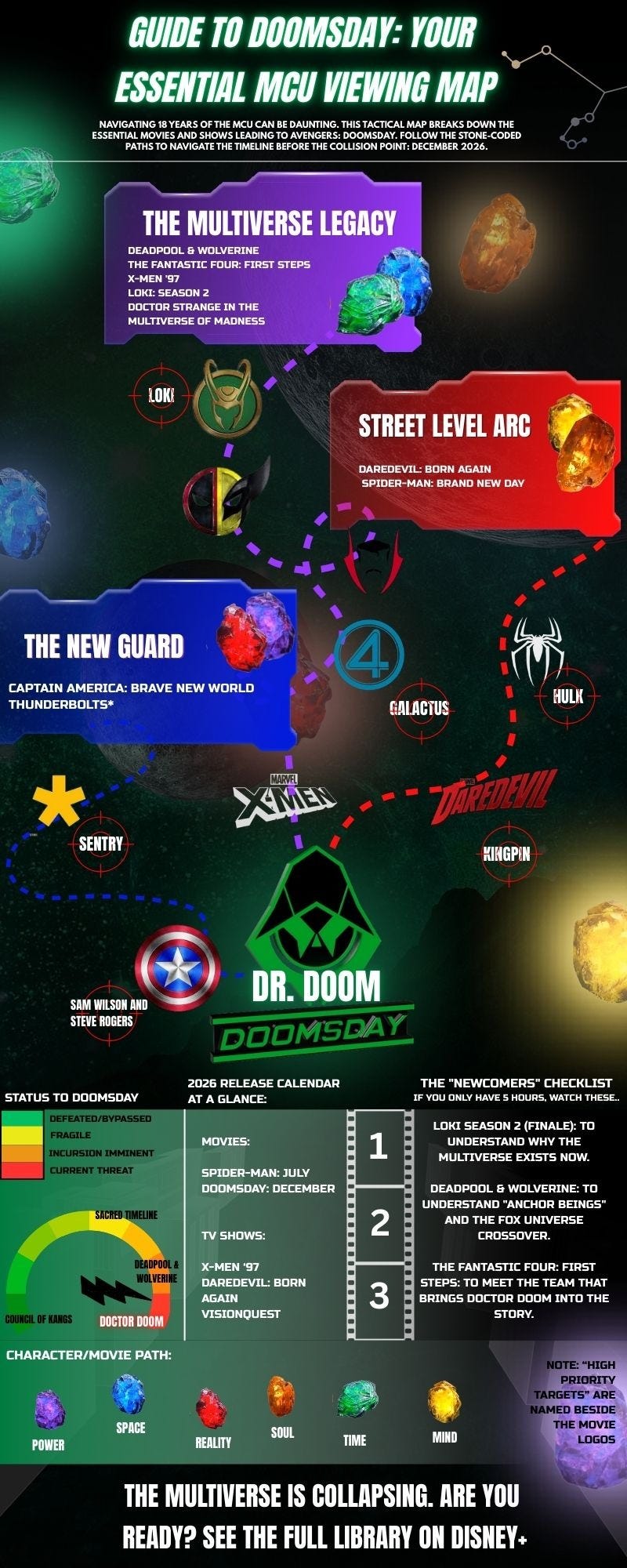
Outline the Pillars: I broke the massive MCU lore into three essential paths: The Street-Level Arc, The Multiverse Legacy, and The New Guard. This was so confusing. 😭
Execute the Vision: Using a high-contrast visual hierarchy, I had to turn 18 years of continuity into a single, scannable briefing. Thank goodness for Canva; that’s the best design/marketing tool :)
The Result: The Guide to Doomsday
My Reflection
And there you go. Now I’ll be honest: this was as fun as it was exhausting. Trying to distinguish between clashing timelines, character arcs, and upcoming releases felt like trying to navigate a collapsing multiverse in real-time🥲 .
How difficult was it? I started with a template to give myself something to work off of, but the real struggle was the “Multiverse Issue.” When stories clash, the layout gets crowded fast. It was so easy to confuse myself, even though I watched almost every movie and understand most of the storylines.
My solution was to treat the key characters, the “High Priority Targets,” adding crosshairs to icons like Kingpin, Sentry, and the Hulk. It gave the map a technical, “tactical briefing” depth without drowning the reader in a wall of text (very important, according to my professors! Visuals are much more relaxing to literally “see” over a massive piece of text).
The Verdict: Even my professor enjoyed the chaos! Her feedback:
“That is a very exciting infographic. Very creative!”
In the end, it’s all about organizing the noise so the audience can find their way.
The Multiverse is collapsing. Are you ready? Mena and I are so excited to get our theater tickets in December 🎬🎞️🤭🍿
— Lizzy the Ronin
Job well done, I am so hyped for this journey myself. I love how we can all appreciate what this means in our own way and you certainly have a fun and unique spin.
I'm a huge marvel fan, so it was immensely gratifying to see you lay the path to Doomsday out like this! Beautifully done!